

[ BRANDING + LOGO ]
PICCIO'S
PIZZA
Giving a new york icon, a fresh and scaleable makeover.
*company is made up, but the designs are real

The Challenge
Piccio has been around since 1915! They felt their logo had become dated and while it's iconic and recognizable, it doesn't scale well or read at a distance.
The Solution
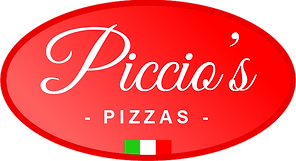
I love the original script type, but gave it a more bold facelift. i retained the original oval shape because it's part of their legacy identity. The apostrophe is a pizza slice as a clever way to convey what type of restaurant they are.


The Impact
-
Appeal - customers noticed immediately -- old and new! Sales increased due to the stronger presence and branding.
-
Heritage - by retaining the original oval shape and including the year they were established, it maintains the brand's legacy as a New York City icon.
-
New Opportunities - by bringing the brand into the 21st century, they were open to other branding opportunities including collectible merchandise and even a custom mobile app for ordering